Blog #170 8/11/16

Beauty photography is a mainstay of fashion and “modern” magazines; I’ve done many hundreds, hunting rather relentlessly for visual treasure. In this Beauty/Body shoot with the model Sigail Currie, I worked, as always, to create something I hadn’t done before, and hadn’t seen before.
With a model like Currie, beauty is a given; enhancing that beauty in an original way is challenging. I spent the morning with hair and make-up artists working to make images of beauty.
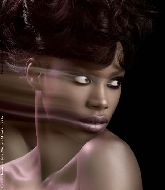
As we worked making the “beauty” image, the New York artist, Deborah Freedman, working in my studio, painted a background for our afternoon adventure which was to use Sigail’s body as a canvas: the “Body” part of Beauty/Body. Deborah and I spoke about what I had in mind for the “body” work and agreed about the backdrop.
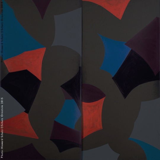
Deborah Freedman’s 10’ x 10’ painting done the morning of the shoot.
After the morning preparations, I showed Deborah’s painting to the make-up artist and explained what I had in mind for the body painting. The raw,
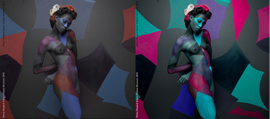
un-retouched image: I purposefully photographed it “flat;” i.e. in low contrast and bare saturation. I did this to be sure every possible detail was “captured,” that nothing was lost. I explain below…
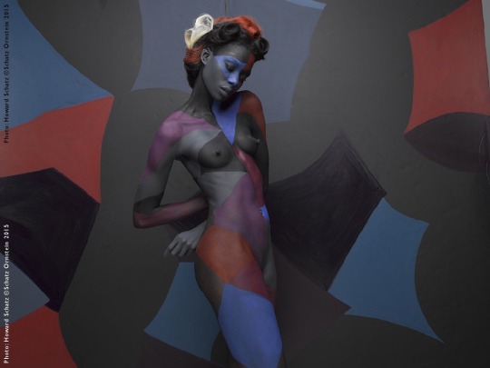
Sigail Currie in the “raw” unretouched photograph
Before the current phenomenal digital ability to alter images in post-production with Photoshop I did all I could in my studio to control light in order to make for the most dramatic contrast. I would cover anything in the studio that wasn’t contributing to the image, so as to minimize any bounce of unwanted (contrast-reducing) light from any surface or direction. I placed black material everywhere so I could light what I wanted lit and block light from everything else. It is one of the reasons photographers wear black clothing in the studio. Preparing the lighting and studio prior to a shoot required a major and thoughtful effort.
These days with post-production technology providing the capability to enhance contrast and color saturation, the best approach is not to shoot with contrast. In other words, I don’t want to make blacks blacker or whites whiter in the initial shoot. When this is done, some detail will be lost for good. What I need to do is capture the maximum amount of information, i.e. “shoot flat” from which I can create any fantasy.
This is the resultant image which, I think, clearly demonstrates the lesson. What started out as intentionally flat, and almost dull, has taken on a vivid life following careful post-production work.
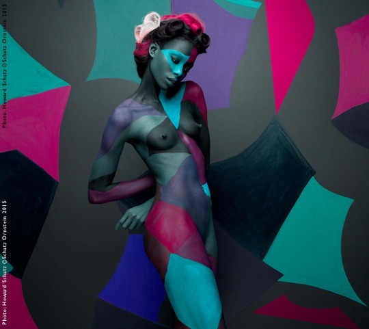
The finished image.
For readily instant comparison:
Makeup: Patrycja Korzeniak
Hair: Damian MonzIllo
Set Design: DEBORAH Freedman
Model: Sigal Currie Q Management
Glitterati Incorporated, the publisher of the Retrospective, Schatz Images: 25 Years is now offering the two- book boxed set at a discount from the original price. The set comes with an 11″x14″ print of the buyer’s choice.
http://schatzimages25years-glitterati.com
