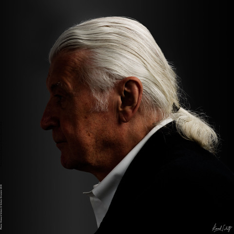
I feel safe in saying that all of the viewers of this journal have read the work of my latest “Above and Beyond” subject. Matthew Carter is not a writer, however; he is a type designer who is without a doubt the most famous creator of print and digital fonts in the world of modern media.
Honored with a MacArthur “genius” Award in 2010, Carter has designed dozens of type faces that are by now ubiquitous. In fact, a 2005 New Yorker profile described him as “the most widely read man in the world,” considering the amount of text set in his commonly used fonts.
Most readers, myself included, tend to take typefaces for granted. Until we have to make choices. A magazine editor friend of mine told me that when he was starting a new magazine and his art director announced that he had to choose the type, he spent the next several days studying fonts and falling in love with one after the other. I have had the same experience choosing type for my books. The emotional response to how letters are formed may be subtle, but it is undeniable.
Among the most utilized of Carter’s many typefaces are the classic web fonts Verdana and Georgia, and the Windows interface font, Tahoma. His other well known designs include Bell Centennial, which he developed initially to be legible in telephone directories, even when printed on flimsy paper at small sizes.
Carter has won numerous awards for his contributions to typography and design, including a Doctorate of Humane Letters from the Art Institute of Boston, an AIGA medal in 1995, the TDC Medal from the Type Directors Club in 1997, and the 2005 SOTA (The Society of Typographic Aficionados) Typography Award. A retrospective of his work, “Typographically Speaking, The Art of Matthew Carter,” was exhibited at the University of Maryland, Baltimore County in December 2002.
Besides Carter’s commercially released fonts, many of his designs have been privately commissioned for companies for their own use. These include work for Le Monde, the New York Times, Time, The Washington Post, the Boston Globe, Wired, and Newsweek.
HS: How do you design a new font?
MC: I always start with the same sequence of letters. Always do the lower case before the capitals. I generally start with the lower case “h,” followed by “o,” followed by “p.”
The reason being, “h” is a straight-sided letter, more or less, with a descending stroke and also an x-height stroke. “o” is round, of course. “p” is sort of half of one and half of the other, and it has a descending stroke. So I’ve got a lot of the metrics in just those three letters. It’s like a sort of DNA.
I can look at those together, how they relate. Very basic things, does it have serifs or is it sans serif, what’s the thick/thin ratio, all those things can be studied just with those three basic letters.
If you’ve got an h, you’ve got a lot of information about m and n and u. If you’ve got a p, you’ve got b, d, q and so on. So, you can extrapolate from one form and build more from that.
After h-o-p, I probably do an oblique letter like v, because that’s another condition. I tend to work a lot on a small subset of the alphabet. Maybe half a dozen letters. And it’s only when you’re fairly confident about them—their forms and their spacing—that you do start to build it out.
A lot of people think that you start with the most interesting letters.
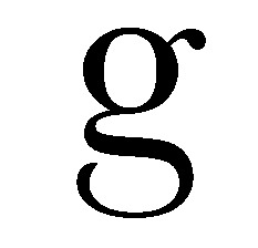
The Baskerville G has a gap in the bottom loop, so it’s easy to identify.
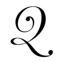
Or my Miller Banner Italic Q which has a nice curly tail.
But those are the last letters I do. They’re capricious. They don’t tell you anything about other letters.
People say what a difference the computer made to type design. Well, it’s true, but the real difference was the coming of the laser printer. As soon as possible I like to print a text. I have one or two kind of funny texts that only use about 12 letters of the alphabet. But I can print those out and get a much better sense of the texture of what a font is going to be.
I tell students that the most important period in the development of a new typeface occurs between when you first think it’s finished, and when it’s actually finished. Because you can see a proof, and you can say, that looks pretty good. I can read it. But at the same time, if you’re honest with yourself, you say, I’m not quite sure this is right. What happens if I change this, or I change that? No, that makes it worse. So you make changes to see what happens…and so on.
You go through a period that requires a lot of patience and perseverance, where you are really sort of testing yourself, to see whether this really is finished. And there is a point where you have to satisfy yourself that this thing is as good as it can be.
HS: What are the emotional factors deciding between something simple as serif versus non-serif?
MC: This is a question a lot of people have studied: The emotional content of typefaces. I’m hopeless at this. I don’t see it. People get an emotional investment in typefaces. Maybe only at a subliminal level, but they do.
If somebody said to me, we want you to design a typeface that would be very welcomed by…I don’t know, teenage girls, or 80-year-old men, I wouldn’t know what to do. I very rarely have subjective feelings about a typeface… this is a great typeface, or a terrible typeface, and so on. Because for me, it’s all dependent on what it was supposed to do, and does it do it.
And you know, type designers, we’re at the bottom of the food chain. We’re hostages to typographers, to graphic designers, art directors, everyone up the ladder. And we can’t police that; we can’t pick up a book and say, oh, you know, this is set in Times Roman, it should have been set in Baskerville. Go change it. You can’t police the use of typefaces. Not in the retail market.
So, the only thing I can say is, where my own work is concerned, it’s very nice when you see one of your faces used well. It’s gratifying.
But it’s also very interesting to see it misused. Because sometimes you learn things. You learn more from seeing a typeface of your own in a situation that you would never have anticipated, never would have used yourself.
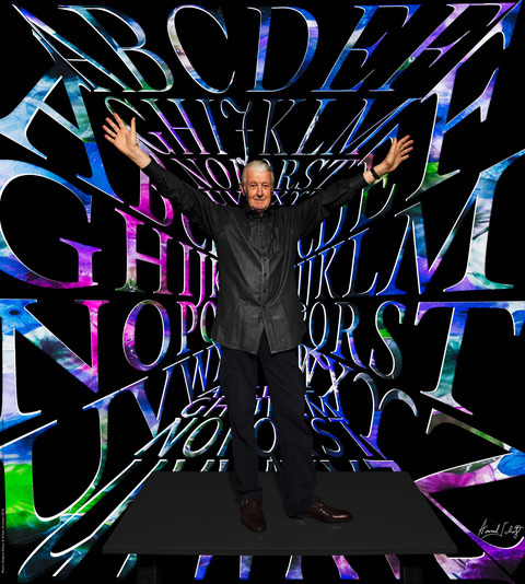
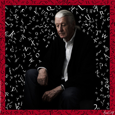
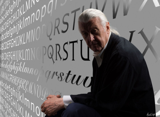
I had asked Matthew Carter to send me a number of his fonts.
He generously obliged. I put them to “work” creating his portraits.
